NY UNIVERSITY ABU DHABI
mobile research & design
Recommended responsive website layout for university’s internal management system after synthesizing research and testing mobile navigation.
LET'S DIG IN
Company
New York University Abu Dhabi (near Dubai), a global research institute and liberal arts college, where I earned my degree in economics and also worked as a UX design intern.
Objective
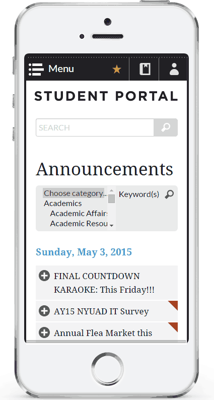
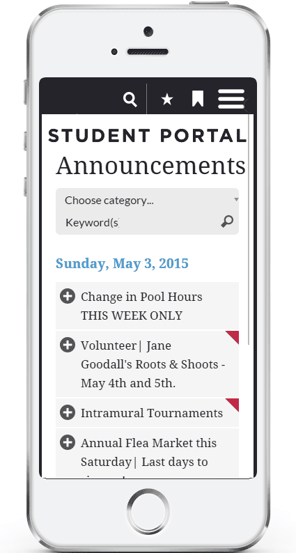
Redesign the mobile user experience and user interface of internal management system for students, staff and faculty (called Student Portal and Intranet, respectively).
Users
1000+ students, staff, and renowned faculty from all over the world, especially the UAE, USA, France, Ghana, China, Russia, etc.
Cases
- Stay updated on recent announcements and RSVP for anything interesting.
- Find relevant information concerning academics, campus life and services.
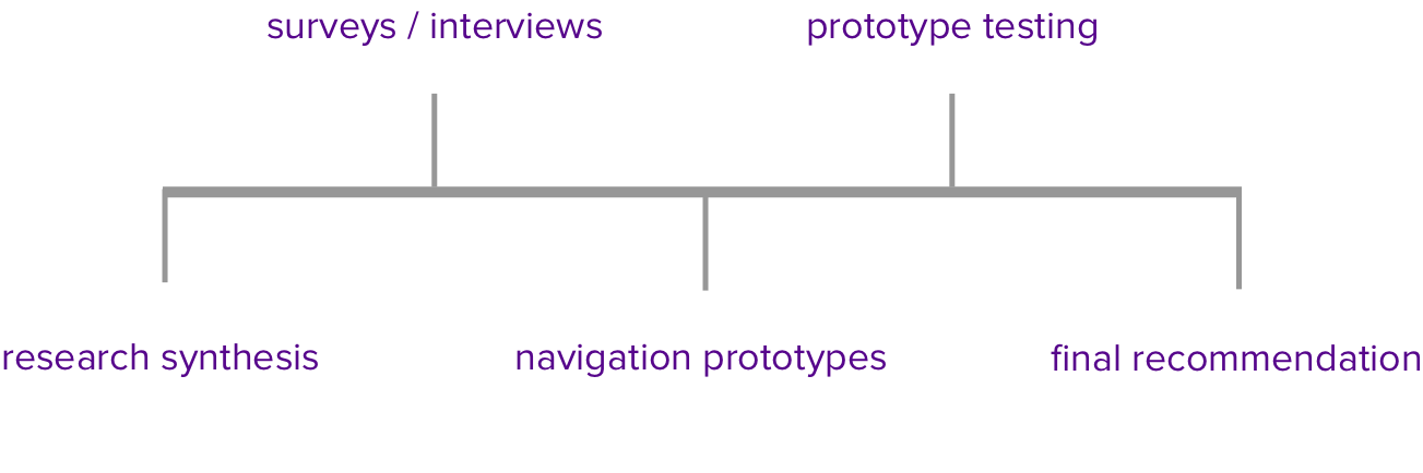
RESEARCH SYNTHESIS

Usability Report

Diary Study

Stakeholder Interviews
I compiled research from usability reports, diary studies, and stakeholder interviews that had already been carried out by the UX team in the format:
Research Finding > Update > Recommendation
Through the research process I uncovered mental models of why users choose to use their mobile phones, especially in NYUAD internal portals. Major findings include:
- Users prefer mobile for lightweight use cases, such as checking announcements and the number of meal plans they have left. For 'heavier' use cases, users will wait until they have time to access a desktop.
- Users prefer to use mobile when they are on the move, such as waiting for a bus or waiting in the checkout line. These use cases should be prioritized in the mobile experience.
SURVEYS
Purpose
- To discover trends in mobile usage, behavior, and preference patterns between year 2013 and 2015
- To get feedback and understand challenges of the current mobile app, NYUAD Students, which is outsourced to an external agency
Method
- Mobile survey between staff / faculty and students released on internal portals with a combination of open- and closed-ended questions
- Interviews with students to discuss their experience with the NYUAD mobile app
- Social media poll with 30% student population participation
Results
- Hit target of 100+ responses within 2 weeks
- Changes in aggregated responses over the past two years were visualized and highlighted
- Presentation with NYUAD web & mobile services team of 10 to discuss survey results and mobile recommendations
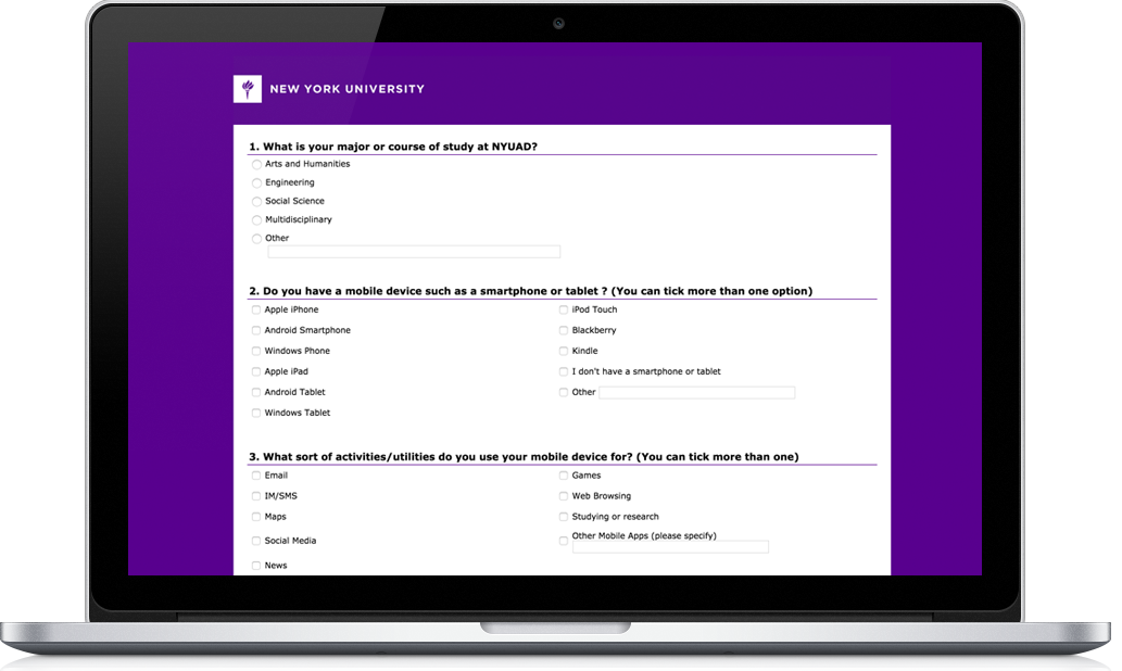
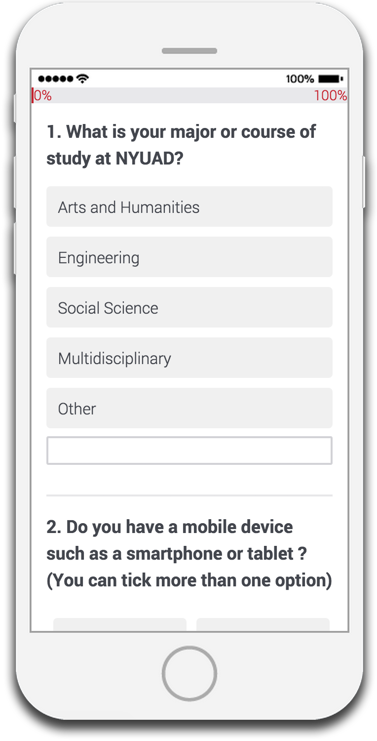
NYUAD Mobile Services Survey for Students
From synthesizing research from Google Analytics, surveys, interviews, diary studies, usability tests, etc., I recommended that support for the NYUAD Students mobile app be discontinued due to low user retention (<5 %), outdated functionality, and major usability issues.
I devoted the rest of the project towards improving the in-house responsive website, i.e. navigation and homepage.
MOBILE WEB NAVIGATION PROTOTYPES
The current mobile navigation presents a major usability challenge.
The information architecture is very complex with up to four levels. Some levels can have more than a dozen elements.
I researched best practices for migrating a large drop-down navigation system from desktop into an efficient mobile experience. The key principle is progressive disclosure, showing the user choices only pertinent to that level.
I built two HTML/CSS prototypes using open source code (codrops) to be able to imitate the functionality and animation as closely as possible to the end product.
Prototype 1
Upper-Left Hamburger Menu Multilevel Push Navigation
Prototype 2
2 Hamburger Menus Homepage Level 1 Selection
PROTOTYPE TESTING
“Health and Wellness? Not sure where that is....”
Sometimes users guessed multiple times before they could find what they were looking for (especially when the category of the item is unclear).
This process took considerably longer in Prototype 2 than in Prototype 1.
“I like to be able to go where I want to go just from the landing page.”
All users preferred to go to their destination directly from the landing page. (Prototype 1 > Prototype 2).
“The text is way too small... also, it’s not easy to scroll.”
It was hard to find a balance between text size, element scannability, and scroll length. It is also technically challenging to design a menu whose items are easy to click, easy to scroll through, and swipeable across levels.
Verdict: Prototype 1
with further improvements
FINAL RECOMMENDATION
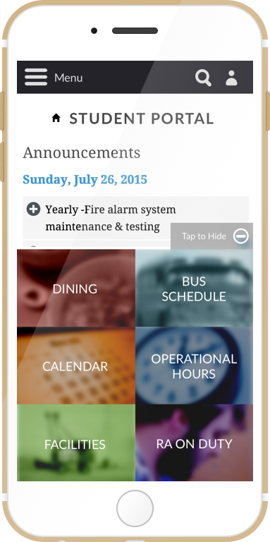
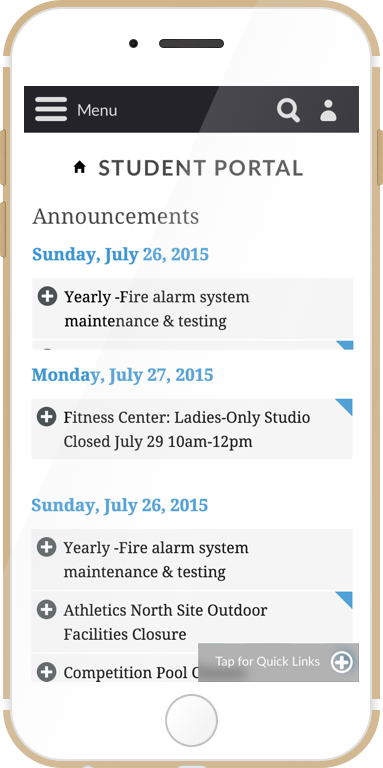
Student Portal Mobile Home Redesign
- 80% of main use cases on mobile determined from interviews / surveys are achievable through two taps anywhere on the website
- Users can easily hide or unhide the swipeable bottom bar to get the full student portal experience
- Full mobile student portal experience is vastly improved due to the navigation redesign
- Future improvements include making use of the bookmark system to be able to personally customize the bottom bar
- Further research for the common use cases for mobile intranet for staff / faculty should be explored and adjusted to this framework
TAKEAWAYS
When researching mobile user experience, understand the context of the user when they choose to use mobile over desktop: when, where, why.
Taking into consideration user preference, resource and technical constraints, I recommend focusing efforts on a great UX for responsive website rather than trying to do both the website and the mobile apps.
Minimize the number of actions necessary for a user to find what they need.
TL;DR
too long; didn't read
Goal
Research and improve the current mobile user experience for NYUAD’s in-house internal portals as well as contracted mobile app.
Challenge
The native mobile apps and responsive web app both had usability challenges. The navigation for the web app was improved through the progressive display of levels.
Learned
Focus improvement on one of the products to optimize for user experience with resource constraints. Make the major use cases on mobile easily accessible on all web pages.